Produmex WMS - Visual Refresh
The refreshed UI is available starting with PMX WMS 2026.10 release .
Overview
Produmex WMS has a refreshed look and feel on the mobile device: both the Mobile client and the Touchclient have been updated. This is a visual-only update: every screen, button, and workflow works exactly the same as before. Nothing about how users scan, pick, pack, or move stock has changed, only how it looks.
The update brings:
- A refreshed color palette
- Updated iconography
- Cleaner, more consistent screen layouts
- A clearer visual hierarchy, with key actions easier to spot
- Better spacing and simpler screens overall
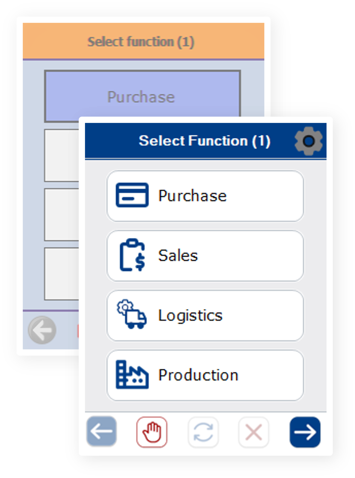
Note: The refreshed UI is only for the Mobile and Touch client, the WMS Add-on was not included in the refresh.
Before / After the Visual Refresh
The example below compares the previous interface with the refreshed one.
What to compare:
- Headline colors: the orange header bar is now blue.
- Icons: buttons and menu items have new, cleaner icons.
- Layout: the same fields and buttons, with better spacing and a clearer hierarchy.
- Position and function: every screen, field, and button is in the same place and does the same thing.
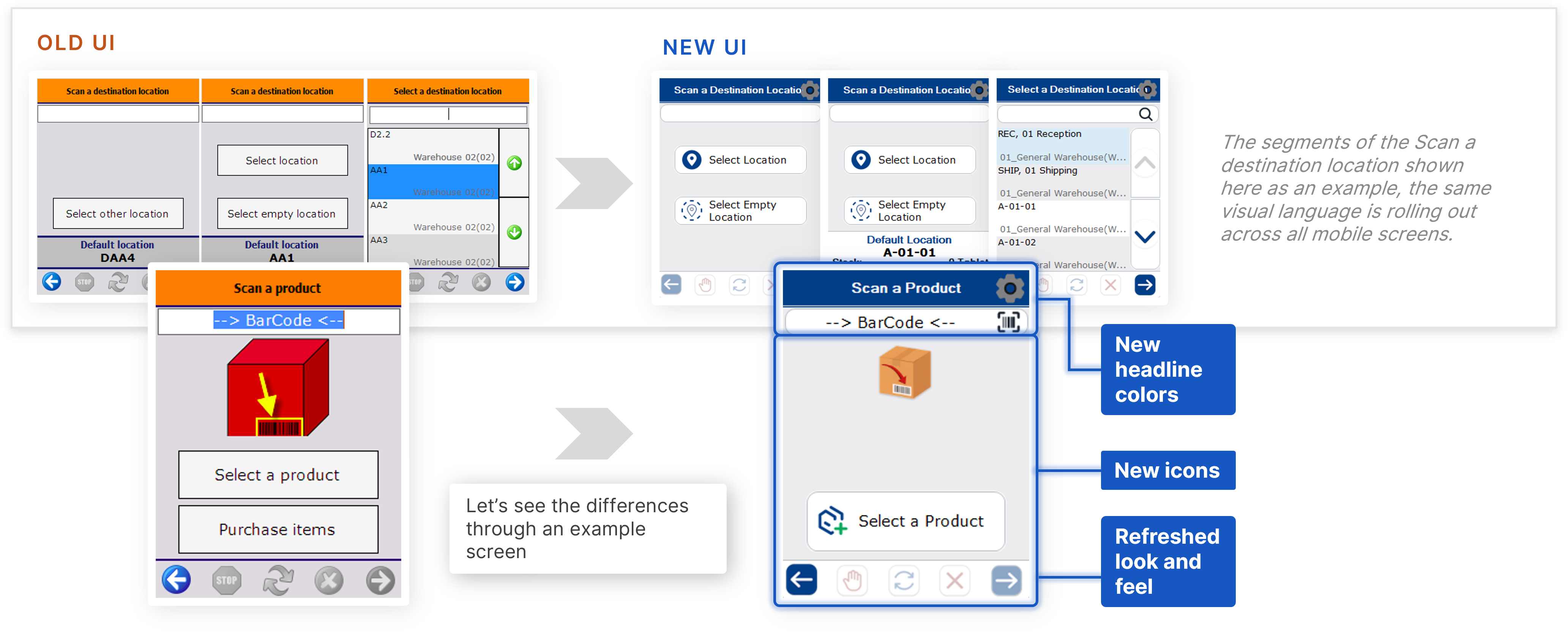
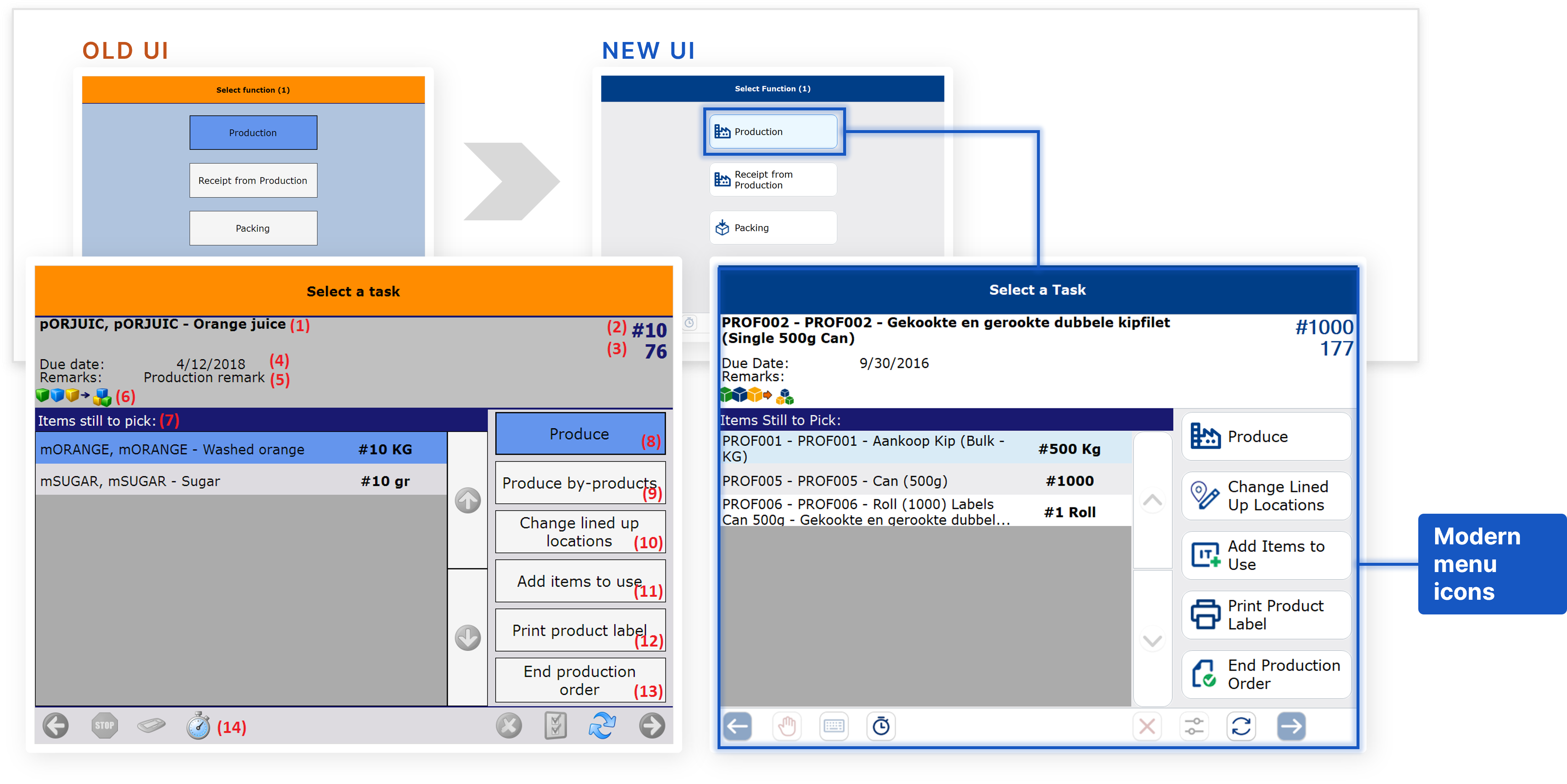
Orange = previous interface. Blue = refreshed interface.
As users will see, the screens, fields, and buttons are all in the same places doing the same things; only the colors, icons, and layout polish have changed.
Where users will see the refreshed UI
The refreshed style is rolling out across the screens of both the Mobile client and the Touch client.
- Mobile client: for example Purchase, Select Function, Scan a Destination Location, Select a Filter, and Select a Location.
- Touch client: for example Production, Select Function, Select a Production Order, and Enter the Quantity Disassembled. It uses the same colors, icons, and layout as the Mobile client, so the experience is consistent on every device.
Note: The documentation aims to reflect the current functionality, but it may take some time to catch up after a release. We actively maintain the DokuWiki, and pages that still show the old screens will be updated with the refreshed UI over time.
What this means for users
- No retraining needed. Every workflow, button, and screen sequence behaves exactly as it did before; users are following the same process, just on a cleaner screen.
- Nothing to configure. The refreshed look is applied automatically; there's no setting to turn on.
- A stronger first impression. Whether it's a daily user, an evaluator, or a partner demonstrating the product to a customer, the interface now looks as polished as the workflows underneath it already are.